10 common UI design mistakes to avoid as a beginner.
UI (User Interface) design is a critical aspect of creating digital products that are both functional and visually appealing. For beginners, it’s easy to fall into common pitfalls that can negatively impact the user experience.
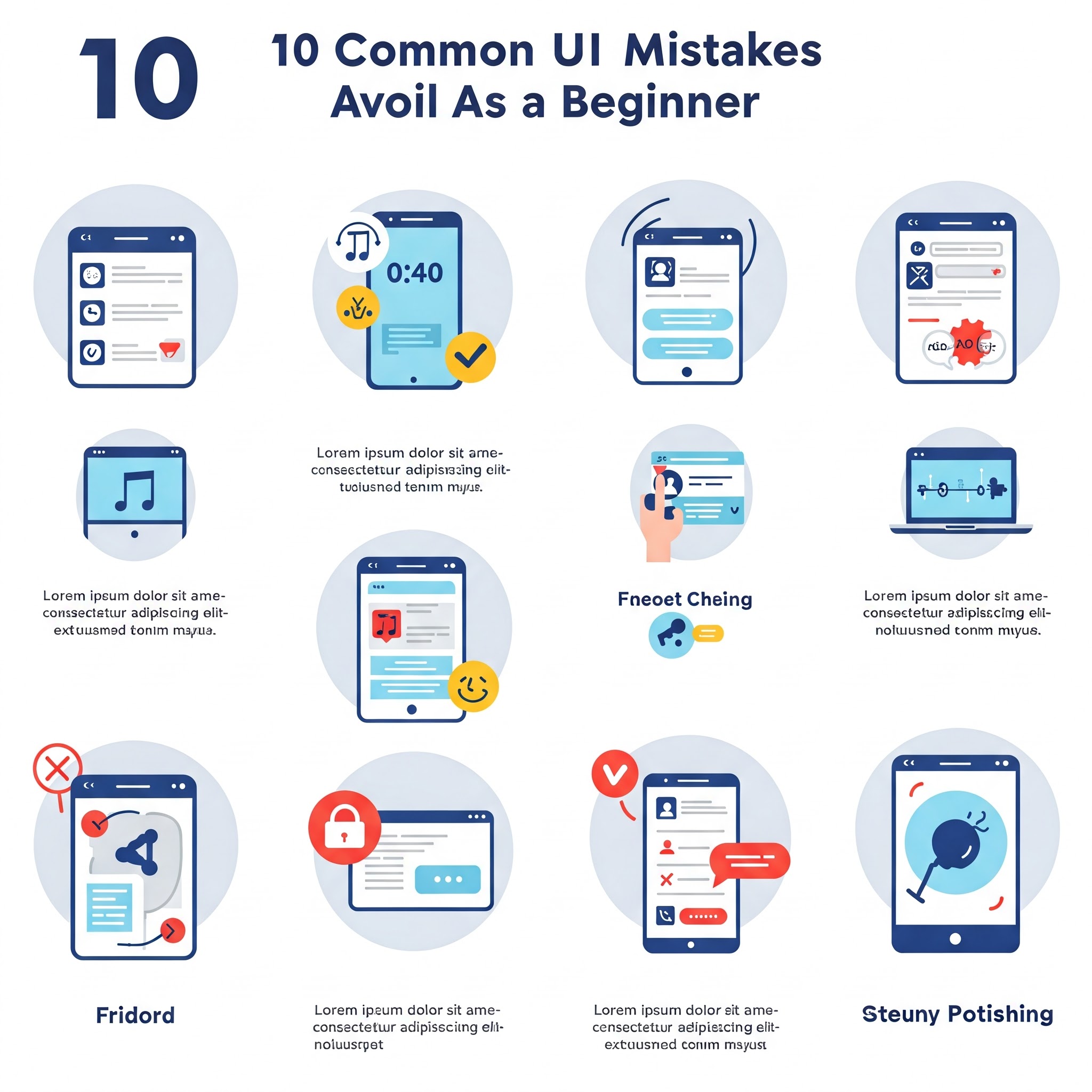
This article highlights 10 common UI design mistakes beginners should avoid, such as poor typography, inconsistent spacing, overcomplicating layouts, and neglecting accessibility. By understanding these mistakes and following a structured approach, beginners can create intuitive, user-friendly designs that resonate with their audience.
Wireframe

Step 1: Understand the Basics of UI Design Before diving into design tools, take time to learn the fundamentals of UI design. Familiarize yourself with concepts like hierarchy, contrast, alignment, and balance. These principles form the foundation of effective design and help you avoid creating cluttered or confusing interfaces. Resources like online courses, books, and design blogs can be invaluable for beginners.
Step 2: Plan Your Layout with Wireframes Start by sketching wireframes to outline the structure of your design. Wireframes act as a blueprint, helping you visualize the placement of elements like buttons, images, and text. This step ensures you avoid overcomplicating the layout and maintain a clear focus on usability.
Step 3: Choose Typography Wisely Typography plays a crucial role in readability and aesthetics. Avoid using too many fonts or overly decorative typefaces. Stick to 2-3 fonts that complement each other and ensure proper hierarchy (e.g., larger fonts for headings, smaller fonts for body text). Pay attention to line spacing and letter spacing to enhance readability.
Step 4: Maintain Consistent Spacing and Alignment Inconsistent spacing and misaligned elements can make a design look unpolished. Use grids and guides to maintain uniformity across your design. Consistent padding, margins, and alignment create a sense of order and professionalism.
Step 5: Use Color Thoughtfully Avoid using too many colors or clashing color combinations. Stick to a limited color palette that aligns with your brand or project. Ensure sufficient contrast between text and background to improve readability, especially for users with visual impairments.
Step 6: Prioritize Accessibility Accessibility is often overlooked by beginners. Ensure your design is usable by everyone, including people with disabilities. Use tools like color contrast checkers and screen readers to test your design. Add alt text to images, ensure interactive elements are keyboard-navigable, and use readable font sizes.
Step 7: Simplify Navigation Complex navigation can frustrate users. Keep menus and buttons intuitive and easy to find. Use clear labels and avoid overcrowding the interface with too many options. A well-organized navigation system enhances the user experience.
Step 8: Avoid Overloading with Information Beginners often try to include too much information on a single screen. Focus on the essentials and use progressive disclosure to reveal additional details only when needed. This keeps the interface clean and prevents overwhelming the user.
Step 9: Test Your Design with Real Users Testing is a critical step in the design process. Gather feedback from real users to identify pain points and areas for improvement. Conduct usability tests to see how users interact with your design and make adjustments based on their feedback.
Step 10: Iterate and Refine UI design is an iterative process. Don’t be afraid to make changes and refine your design based on feedback and testing. Continuously seek inspiration from other designs and stay updated on industry trends to improve your skills over time.